Have you ever been on a subway or looked at signs in a train station and noticed that the writing looks the same? That’s because they use a special kind of font called a subway font, metro font, or transit font. They’ve been using these fonts for a really long time in transportation systems all over the world. In this article, we’ll learn about the history of subway fonts, how they’re designed, where to download and where they’re used.
Table of Contents
The History of Subway Fonts
In the early 20th century, subway fonts made their debut in New York City’s subway system. The first subway font was designed in 1916 by Edward Johnston for the London Underground. Johnston’s typeface was simple and easily legible, making it perfect for the underground environment.
This font served as the inspiration for the New York City subway’s original font, designed by Squire Vickers in 1904. Over time, subway fonts have undergone evolution to cater to the changing needs of transportation systems.
Presently, subway fonts are designed to be legible from a distance and in various lighting conditions. They are also created to be easy to read rapidly, which is essential in a fast-paced environment such as a subway station.
The Design of Subway Fonts
Subway fonts are typically sans-serif fonts, which means they do not possess serifs (the small lines or flourishes at the end of letters). Sans-serif fonts are more legible than serif fonts at small sizes and on screens, making them ideal for subway signage.
Subway fonts are designed to be clean, simple, and easy to read. They usually have uniform stroke widths, which means that each letter has the same thickness throughout. This uniformity makes the font easy to read rapidly, even from a distance.
Subway fonts also have large x-heights, which is the height of the lowercase letters compared to the uppercase letters. A large x-height makes the lowercase letters more prominent, which makes the font easier to read. Subway fonts also have open apertures, which are the spaces inside letters like “a” and “e.” Open apertures make the letters more distinguishable and easier to read.
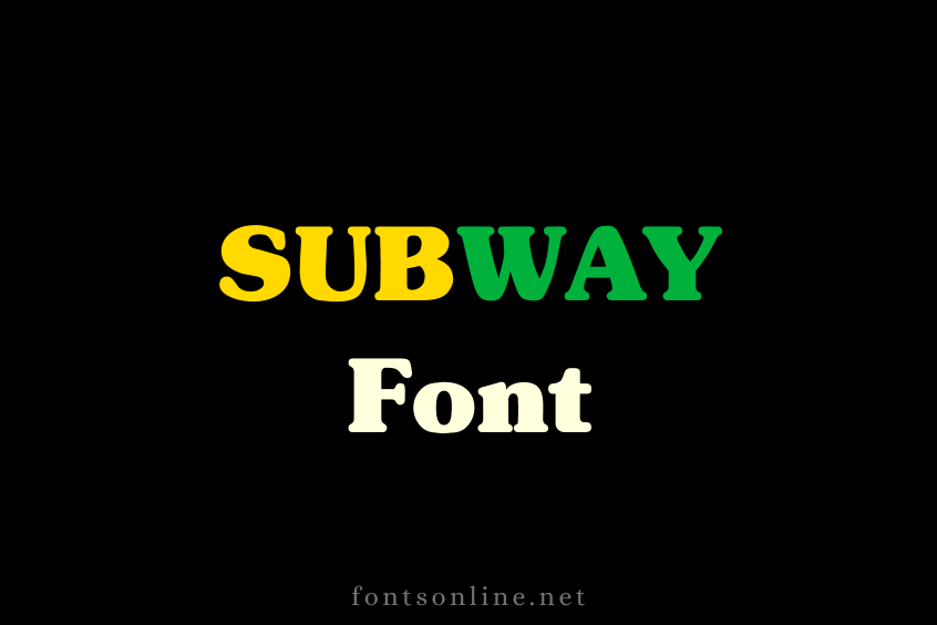
Preview of Subway Font
Upper Case of Subway Font

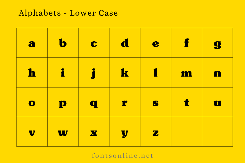
Lower Case of Subway Font

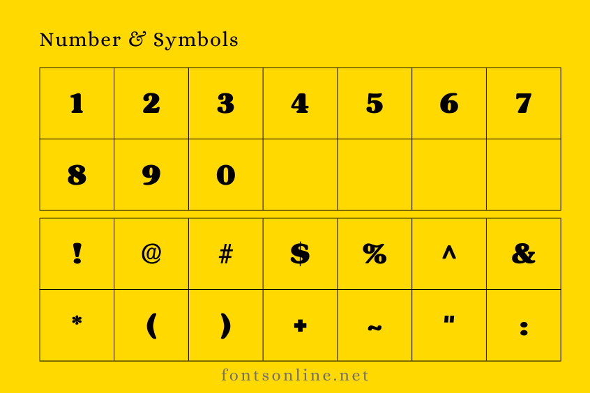
Number and symbols of Subway Font

The Usage of Subway Fonts
Subway fonts are used in various transportation systems around the world, including the New York City Subway, the London Underground, and the Paris Metro. These fonts are also used in other public spaces such as airports and shopping malls, where legibility and ease of reading are important.
Subway fonts are also popular in graphic design and typography. They are often used in logos and branding for companies and organizations that want to convey a sense of simplicity and reliability. Subway fonts are also popular in digital design, where their legibility and clean lines make them perfect for user interfaces and website design.
The Downloading of Subway Fonts
If you are interested in using subway fonts in your design projects, there are numerous online sources where you can download them. One popular website for downloading subway fonts is www.fontsonline.net. This website offers a wide selection of subway fonts in various styles and formats.
To download Subway fonts from Fonts Online, simply visit the website and search for “Subway fonts” in the search bar. You can then browse the selection of subway fonts and choose the one that best fits your needs. Once you have selected a font, simply click on the “Download” button and follow the instructions to install the font on your computer.
Conclusion
Subway fonts are an indispensable aspect of public transportation systems worldwide. They are designed to be legible, easy to read, and rapidly recognizable. Subway fonts are also popular in graphic design and typography, where their simplicity and clean lines make them perfect for logos and branding.
Frequently Asked Questions
Subway fonts are a style of fonts that are commonly used in public transportation systems, such as subway and metro systems, as well as in other public spaces where legibility and ease of reading are important. Subway fonts are typically sans-serif fonts that are designed to be clean, simple, and easy to read, even from a distance.
Subway fonts are popular because they are highly legible and easy to read, even at small sizes and on screens. They are also clean and simple in design, which makes them versatile and easy to use in a wide variety of design applications.
Yes, you can use subway fonts in your design projects, as long as you have the appropriate licensing for the font. Some subway fonts are available for free, while others require a license fee. Be sure to check the licensing agreement for each font you use to ensure that you are using it legally.
There are many online sources for downloading subway fonts, including www.fontsonline.net, as well as other font websites and marketplaces. Be sure to choose a reputable source and check the licensing agreement before downloading any fonts.
Some examples of subway fonts include Helvetica, Arial, Gotham, and DIN. Each of these fonts has its own unique style and characteristics, but they all share the clean, simple, and legible design that is typical of subway fonts.

